Reports and Analytics
Reports and Analytics
Beyond the day-to-day dashboards, Credit Control includes a set of reports that answer the questions management asks — how fast are we getting paid, who collects best, how much are we likely to lose, and what's coming in. You'll find them in the Credit Control workspace under Reports. Each opens with a date or period filter.
DSO Trend
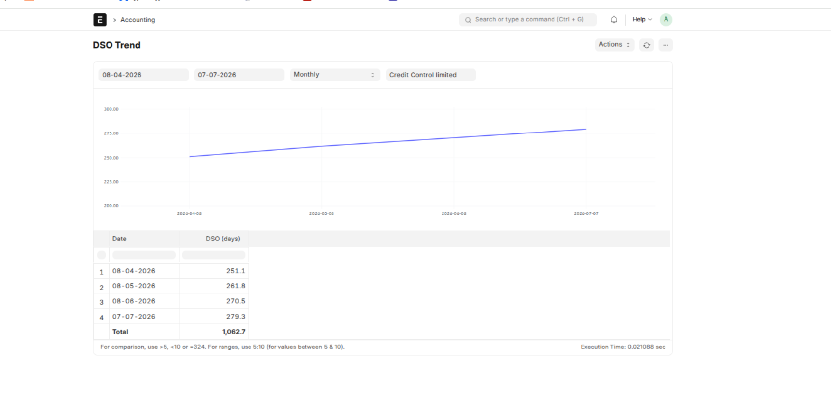
What it is: DSO stands for Days Sales Outstanding — the average number of days it takes to collect payment after making a sale. If your DSO is 45, it means, on average, customers take 45 days to pay after they're invoiced.
Why it matters: DSO is one of the clearest signs of how healthy your collections are. A low DSO means cash comes in quickly. A high DSO means money is tied up in unpaid invoices — cash you've earned but can't use yet.
What this report shows: Rather than a single number for today, this report plots DSO as a line over time (weekly by default), so you can see the direction it's moving.
How to read it:
- A falling line is good — you're collecting faster than before.
- A rising line is a warning — collections are slowing down, and it often shows up here before it becomes an obvious cash problem.
- A flat line means things are steady.
What to do: If the line is trending up, that's your cue to look closer — which customers or segments are taking longer to pay? The other reports below help you find out.
CEI by Dimension
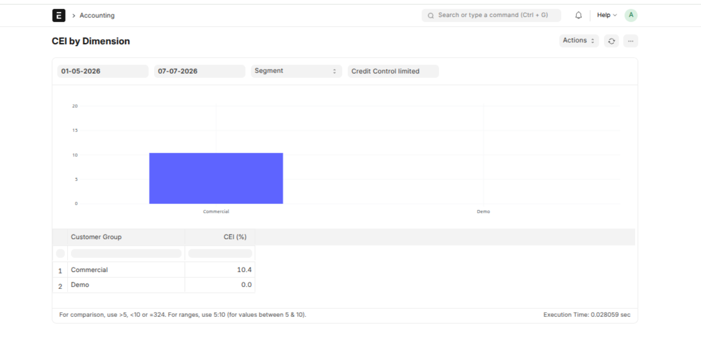
What it is: CEI stands for Collection Effectiveness Index. It measures how much of the money you could have collected in a period you actually collected — expressed as a percentage. 100% would mean you collected everything that was collectable.
Why it matters: Where DSO tells you how long payment takes, CEI tells you how good your team is at collecting. A high CEI means the collections effort is working; a low CEI means money that should have come in didn't.
What this report shows: It breaks CEI down by dimension — meaning you can view it per collector, per customer group, or per territory. So instead of one company-wide number, you see who and what is performing.
How to read it:
- Compare collectors — a collector with a much lower CEI than the others may need support or a lighter caseload.
- Compare customer groups or territories — a segment with consistently low CEI may signal a riskier customer base or a process problem in that area.
What to do: Use it to direct attention — coach the collectors who are struggling, and tighten credit in segments that keep under performing.
Bad Debt Ratio
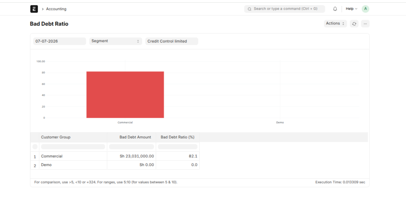
What it is: The bad debt ratio is the share of the money owed to you that is unlikely to ever be collected — the truly stuck, long-overdue receivables.
Why it matters: Not every unpaid invoice gets paid. Some become losses. This report estimates how much of your receivables are at that point, so you can see the real risk sitting in your books rather than assuming everything owed will eventually arrive.
What this report shows: The bad debt ratio overall, plus a breakdown by collector, customer group, and territory — so you can see where the likely losses are concentrated.
How to read it:
- A rising overall ratio means more of your receivables are going bad — a red flag.
- A high ratio in one segment (say, one territory or customer group) tells you the risk isn't spread evenly — it's coming from a specific place.
What to do: Where the ratio is high, act on credit policy — tighten limits, require more upfront, or review whether you should extend credit to that segment at all.
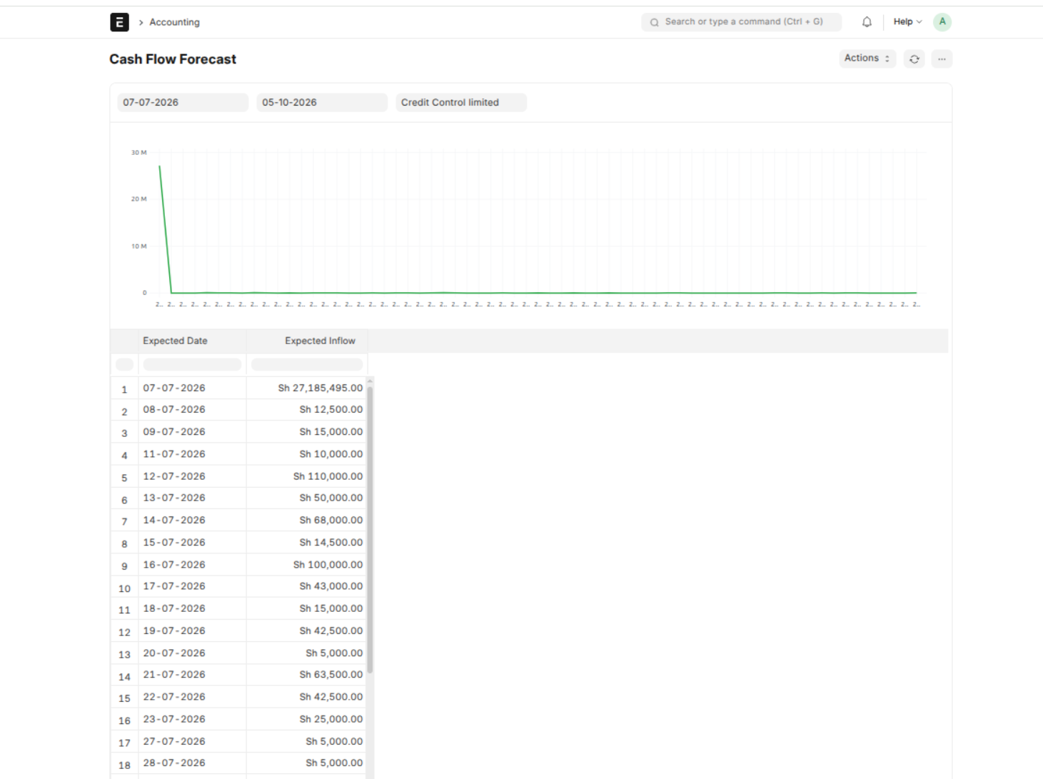
Cash Flow Forecast
What it is: A projection of the money you expect to come in over an upcoming period, based on the invoices currently outstanding and when they're due.
Why it matters: Finance needs to plan — will there be enough cash next month to cover expenses? This report turns your outstanding invoices into a forward-looking estimate of incoming payments, so cash position is anticipated rather than a surprise.
What this report shows: Expected inflows over a date range you choose, drawn from what's owed and each invoice's due date.
How to read it: Look at the projected amounts across the period. Thin patches — weeks or months where little is expected to come in — are the ones to plan around.
What to do: Use it for planning: if a lean period is coming, you can prioritise collections on invoices due then, or arrange to cover the gap.
Payment Cohorts
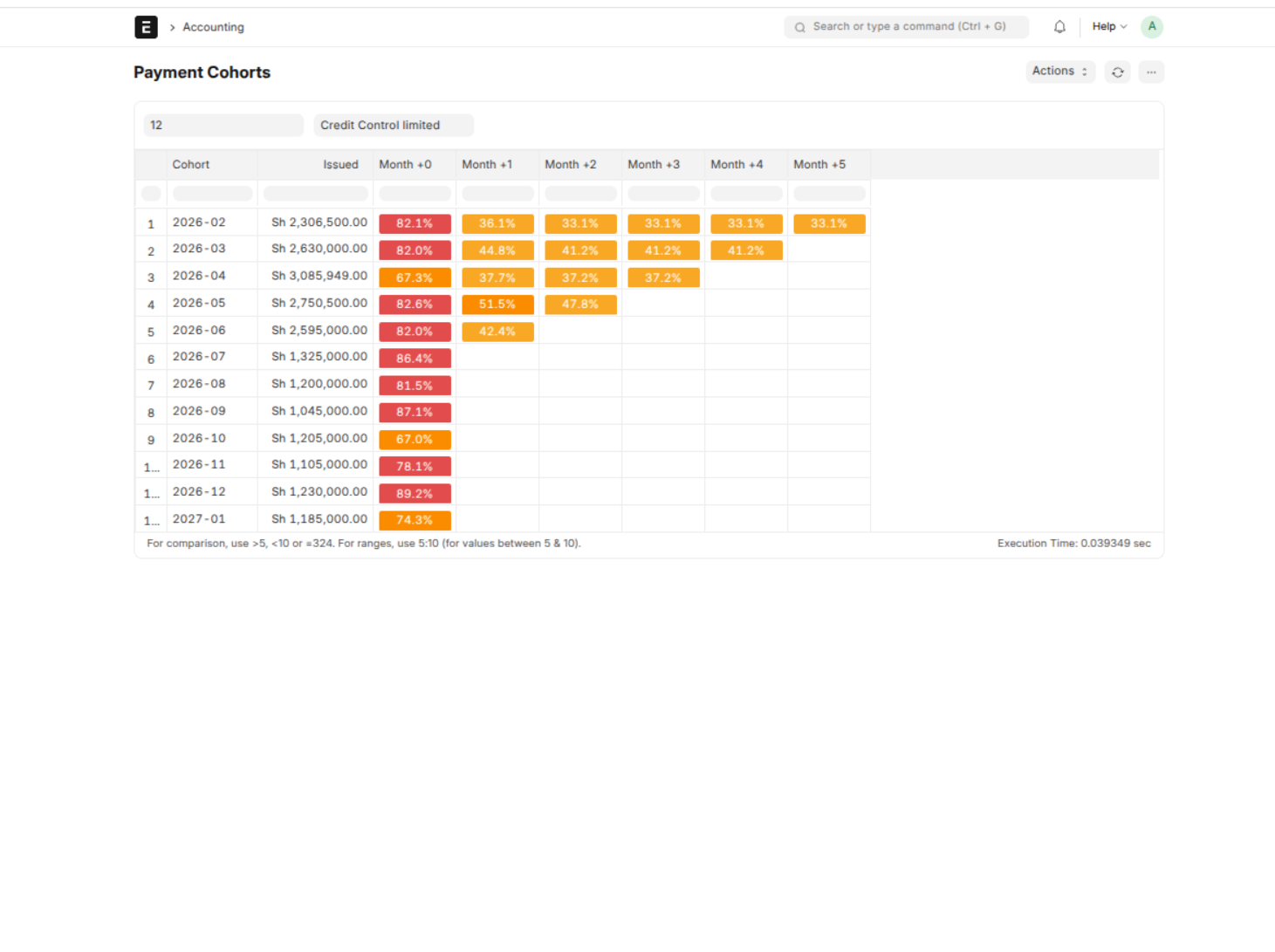
What it is: A "cohort" is a group of customers grouped by when they started with you (for example, everyone on boarded in January). Cohort analysis tracks how each group's payment behavior develops over the months that follow.
Why it matters: It answers a question a single snapshot can't: are the customers we're taking on recently as reliable as the ones we took on before? If newer cohorts pay worse than older ones, something in how you onboard or grant credit may have shifted.
What this report shows: Payment behaviour by cohort over time — so you can compare how, say, customers onboarded six months ago are paying versus those onboarded a year ago.
How to read it: Compare cohorts. If recent cohorts consistently pay slower or default more than older ones, that's a signal worth investigating.
What to do: If newer cohorts look worse, review what changed — did onboarding get looser, or credit limits get more generous? It's an early way to catch a policy drift before it becomes a bad-debt problem.